Testing for the front-end is different. There's more to it than just writing a Jasmine or Selenium test unit to check the validity of your core logic and business implementations. When it comes to testing, front-end has a visual dimension that often gets neglected. If not, then how the front-end performs is left to fate.
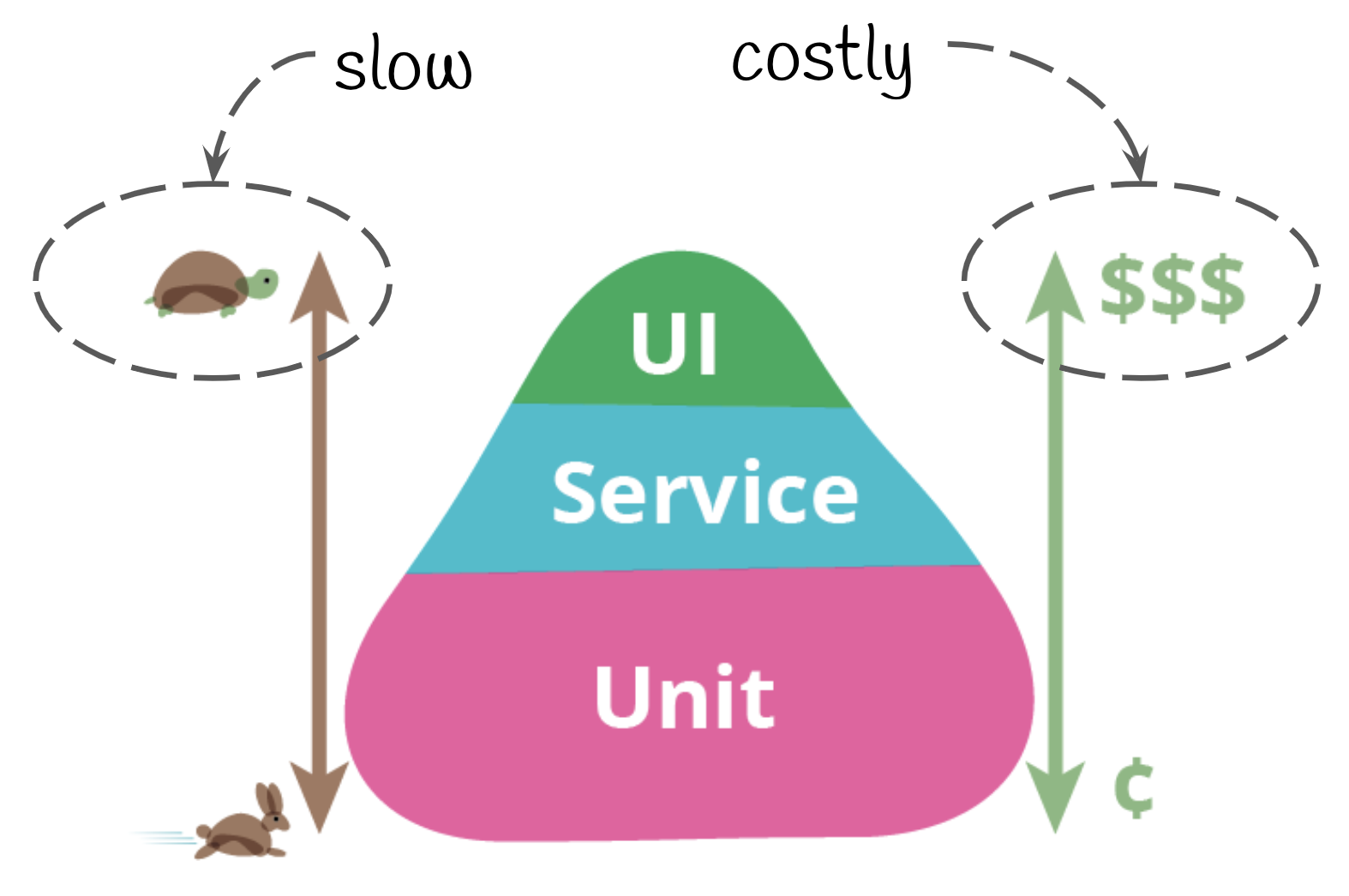
An ideal test suite consists of three layers - the unit tests, the integration/service tests, and end to end (e2e) tests. The number of tests associated with each category decreases across the list to form a pyramid.

Unit tests tend to be the largest component of a testing suite because they are cheap to create, simple to implement and easy to automate. Martin Fowler talks about unit tests as being part of a balanced testing portfolio for an application.
Integration or service tests have a broader scope. While unit tests look at distinct components within your app, integration tests deal with how the code works together. The combination of unit and integration tests often catches business logic bugs before they become a major issue.
End to end tests sits on the other side of the testing suite and deals with how an actual user would interact with the application. The issue with end to end is that they are often time consuming and it is hard to automate. In addition to this, the front-end is the digital representative of your app - it is the point of sale, the self-service customer support and branding tool. A broken front-end can result in sub-par user experience, which can lead to brand erosion over time.
The shortfalls of front-end testing
The testing pyramid was originally created for back-end development. The major difference between back-end and front-end is that the later has a visual component attached to it. Unit and integration tests deal only with the logic and its implementation, not how things appear on the screen. It discards the visual interactive elements with the users and the devices the app is served on.
There are over 24,000 phone models that supports Android. This means 24,000 different ways your app could render. While there is a general standardized sizing guideline that each device can fall into, the complexity of front-end is that the visual components and how they render is often not tested. The front-end is often complex and changes rapidly. A simple change in the CSS, its preprocessors or HTML structure can have a cascading and domino effect.
The only time an issue is caught is either when a visual bug is reported or through an end to end test. E2e tests are expensive to implement because there is a manual component to it, in addition to the lack of tools available in this area. They are also slow to execute, difficult to maintain and significant test cases are often discarded when new designs and layouts are introduced. This hampers on a development team's ability to perform at speed, increases maintainability and reduces overall consistency when time pressures are applied.
Catching visual bugs before they catch your users
From a design perspective, creating an attractive and user-friendly interface is a top priority. However, even the slightest visual bug can disrupt the overall user experience and cause frustration. Furthermore, these bugs can be difficult to spot and often go unnoticed until it's too late.
Visual glitches such as misaligned or overlapping elements, incorrect text rendering, and images that are not correctly scaled or cropped can often cause confusion or frustration for users, leading to poor user experience. These visual glitches are also not often caught by unit and service tests because the visual factor extends beyond their scope. This is because unit and service tests are functional tests.
In the context of user experience (UX), functional testing ensures that all the features of a product are working correctly while visual testing checks the visual design and layout of a product. While both of these types of testing are important, they can have a different impact on the user experience.
Without front-end testing, it is difficult (if not impossible) to ensure that the user interface is working properly and that no critical data is being lost or corrupted. This can result in a number of issues, such as broken or incorrectly functioning user interfaces, incorrect data being displayed, and users being unable to complete necessary tasks. While it is certainly possible to catch some of these issues by relying on manual testing alone, it is generally not possible to catch all of them. In fact, many of these issues may not be noticed until the website or application is in use by actual customers.
So how do you catch visual bugs before they catch your users? The answer is automated visual testing.
With automated visual testing, your team can detect changes in the graphical elements of an application. This is important because a glitch can negatively impact the usability and brand identity.

How automated visual testing works
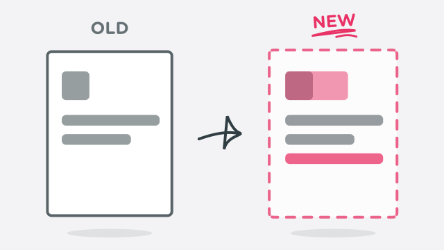
Visual regression testing works by comparing two versions of an image. The first image is the original image, and the second image is the image after the code change. Any differences between the two images are noted, and the results are saved. This methodology is slow to manually execute. However, due to the repetitive nature of visual regression testing, this means that it can be automated.
Automated visual testing tools use screenshots taken at different points during the testing process to compare results and look for discrepancies. Any changes or glitches in the screenshots will be flagged, so that they can be diagnosed and fixed by the development team.
The most common automated visual testing tools use either images or video to compare results. For example, if an application’s login screen changes between two screenshots, the automated visual testing tool will identify that difference.
Some automated visual testing tools use video instead of screenshots. These tools will film an application during the testing process and compare the results. This can be helpful for identifying issues with animations and transitions. For example, if an element appears to be moving too quickly or too slowly, the automated visual testing tool will identify that difference.
Regardless of how it’s done, automated visual testing is a great way to ensure that an application’s graphical interface is functioning correctly. By comparing screenshots and videos taken at different points in the testing process, automated visual testing tools can help to identify any discrepancies in an application’s graphical interface. This can help to ensure that an application looks and functions the way that it’s supposed to.
Wrapping up
The purpose of visual regression testing is to catch regressions – changes in the appearance of the software or application that may not have been caught by other forms of testing. Unit and service tests can only the robustness of your logic and processes. It doesn't cover the additional dimension of the user interface.
Automated visual regression testing is a tool that is easy to use and can easily be incorporated into your existing testing process. In addition to this, it tends to be inexpensive to set up and use. Consistency of user experience is a major factor in creating a seamless interface, regardless of device and context that they interact with your business.